go to top scroll for more

Visualisations

Visualisations are a good way to get to grips with large datasets in an easily digestible form. We are gathering together useful tools to help understand energy-related datasets in a visual context. The EDC would welcome other visualisation examples - please contact us

Photo by EDC

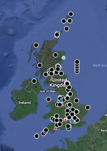
Energy System Demonstrators are physical demonstrations testing new technologies for low-carbon energy infrastructure. A review of energy systems demonstrator projects in the UK has been undertaken for the UK Energy Research Centre (UKERC) by the Energy Systems Research Unit (ESRU) at the University of Strathclyde.

02/11/2018

Photo by EDC

The Centre for Integrated Renewable Energy Generation and Supply (CIREGS) at Cardiff University's School of Engineering was established in 2008 as a multidisciplinary engineering research group with international expertise in the supply, transmission and demand of energy

22/11/2023

Photo by EDC

The Carbon Intensity Dashboard contains visualisations of UK Carbon Intensity data, split into 4 sections. These sections are: Current Carbon Intensity, History of Carbon Intensity of Generation, Current Generation Mix and Carbon Emissions, and Carbon Intensity of Balancing Actions.

06/11/2024

Photo by EDC

GridWatch is a dashboard that contains visualisations of UK grid data that covers many different areas, such as: GB Fuel Type Power Generation Production, GB Electricity National Grid, CO2e Output per Production Type, and Power Grid Frequency.

10/07/2013

Photo by EDC

The Mining Remediation Authority map viewer allows you to view selected coal mining information in your browser graphically. This map viewer is divided into 4 individual themes, being: Planning, Coal Mining, Mine Water Heat, and Metal Mines - England.

26/07/2024